Come ottimizzare il “conversion rate ecommerce”?
conversion rate optimization
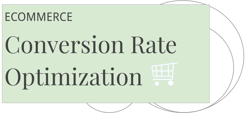
4 regole per convertire
Rimuovere distrazioni
Togliere tutti gli elementi della pagina non funzionali alla conversione
Rimuovere ostacoli
Togliere campi obbligatori non necessari ecc
Infondere senso di sicurezza
Inserire informazioni e simboli sulla sicurezza dei pagamenti
Infondere senso di urgenza
Comunicare la scarsa disponibilità di prodotto o la scadenza di promozioni
Ottimizzare il conversion rate ecommerce significa ottimizzare la user experience. Due sono le tipologie di conversioni che possiamo avere sul sito: macro e micro conversioni.
Per macro conversioni si intende generalmente il completamento dell’acquisto, mentre le micro conversioni sono varie e includono la registrazione alla newsletter, la compilazione di un modulo di contatto o l’aggiunta di un prodotto al carrello ma senza l’acquisto.
Di seguito 31 suggerimenti per migliorare l’esperienza utente e facilitare la conversione ecommerce.
- Rendere visibili e chiare le call to actions (CTA). I pulsanti di azione devono essere visibili “above the fold” o “sticky” (sempre visibili anche quando si scrolla”. E devono contenere un verbo di azione rilevante ad esempio: “acquista ora”, “scarica gratuitamente”, “prenota ora” o altri.
- Ridurre al minimo il numero di campi dei form da compilare.
- Ridurre al minimo i campi obbligatori nei form
- Inserire un form per l’iscrizione alla newsletter nel footer e nel contenuto delle pagine principali
- Utilizzare un contenuto gratuito o altro incentivo per incrementare le iscrizioni alla newsletter
- Offrire due o tre incentivi diversi sul sito per soddisfare meglio le aspettative dei diversi utenti.
- Inserire delle popup form per raccogliere leads (indirizzi email)
- Esplicitare quale problema o bisogno del cliente il nostro prodotto risolve. la posta Unique selling proposition deve indirizzare un problema specifico del cliente.
- Esplicitare le garanzie sul prodotto es. 24 mesi, 10 anni.
- Esplicitare le garanzie sull’acquisto 30 giorni per cambiare idea e ricevere un rimborso completo
- Esplicitare le garanzie sul trattamento dei dati. No spam, non diamo i tuoi dati ad altri
- Inserire simboli sulla sicurezza dei pagamenti ad esempio un lucchetto
- Ridurre le distrazioni nel checkout e nelle landing pages
- Rendere i testi delle landing page coerenti con gli annunci pubblicitari
- Inserire le recensioni dei clienti in prossimità delle call to actions e nelle landing pages
- Utilizzare countdown per spingere l’utente a velocizzare l’acquisto
- Testare due o più versioni di CTA per vedere quale funziona meglio ab testing
- Offrire più metodi di pagamento ad esempio Paypal, Carta di Credito, Bonifico
- Ridurre il tempo di caricamento delle pagine riducendo il peso delle immagini
- Assicurarsi che tutto il sito sia protetto attraverso https
- Offrire una chat o un numero di telefono per supporto Durante l’acquisto
- Usare delle grafiche animate per attirare l’attenzione su specifici elementi della pagina
- Usare infografiche per spiegare il prodotto in vendita
- Localizzare le descrizioni dei prodotti nella lingua del cliente
- Assicurare la leggibilità e usabilità anche su cellulare
- Fare delle prove di acquisto per assicurarsi che il sito e il checkout funzionino correttamente
- Ingrandire la dimensione dei bottoni su mobile
- Inserire una propria foto nella landing page. Questo riduce il senso di rischio per il cliente sapendo che c’è una persona reale dietro il prodotto o servizio offerto
- Usare foto di persone sorridenti, è diffusamente ritenuto che persone sorridenti convertono meglio.
- Guardare su Google Analytics quali pagine hanno un bounce-rate è un exit-rate alto, analizzare il perché e ottimizzarle
- Guardare su Google Analytics quali pagine hanno un conversion rate alto ma poco traffico e promuoverle dando loro più visibilità sul sito o tramite annunci pubblicitari.
Leave a Reply